

Workstreams: Making outsourcing and acquiring inspection jobs simple
About the Brand: Workstreams is a sister brand of Inventory Base - an end-to-end property software solution for producing detailed property and inventory reports. To handle an overflow of inspection jobs, Workstreams was created to help property managers outsource these extra jobs to clerks outside of their teams.

Product Design
Graphic Design


Role: Product Design, Logo & Branding, Design Systems
Tools: Figma, Adobe Illustrator, Miro, Notion
Industry: SaaS, B2B
An intuitive workspace
Putting ourselves in our users shoes, we knew outsourcing work to external entities would be an added responsibility and process for them.
For this reason, the workspace for completing and managing jobs had to be as clear, simple and intuitive to operate as possible.
To create a record of active, upcoming and past inspection jobs,
I adopted collapsable tabs to act as a virtual filing cabinet which could be opened for more details, and closed on the same page. This made sure all important inspection details sat in the same space, reducing the need for extra cognitive load by jumping between additional pages or modals.
To make processing these detailed informations more enjoyable and instant, designed cards which laid out the information using visual hierarchy, negative space, effective chunking of information, and icons as visual aid were used.
This successfully made reading the workspace less overwhelming, clearer and more pleasant by using design methods to move away from traditional document style workspaces.
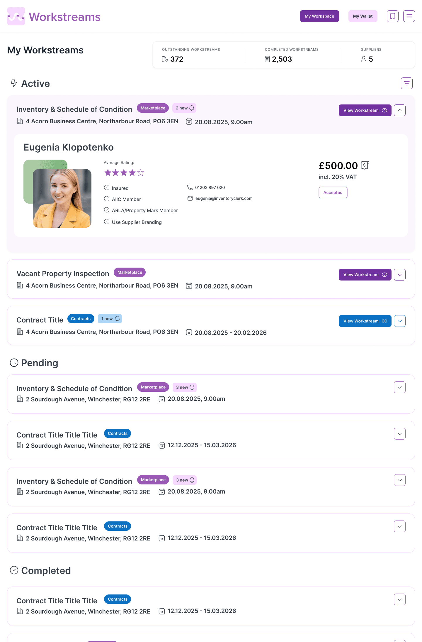
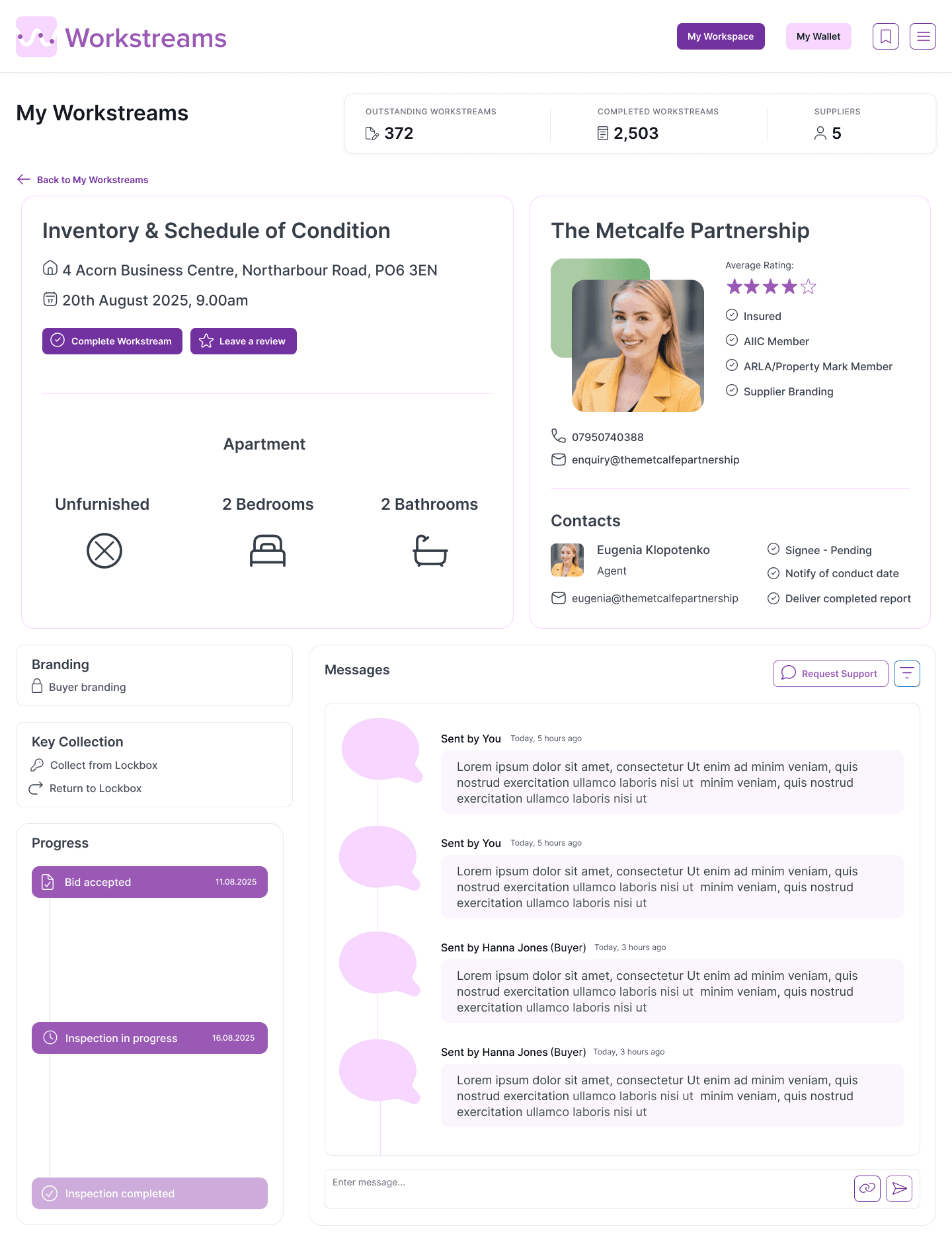
Full/Active Inspections Page
ENSURING USABILITY
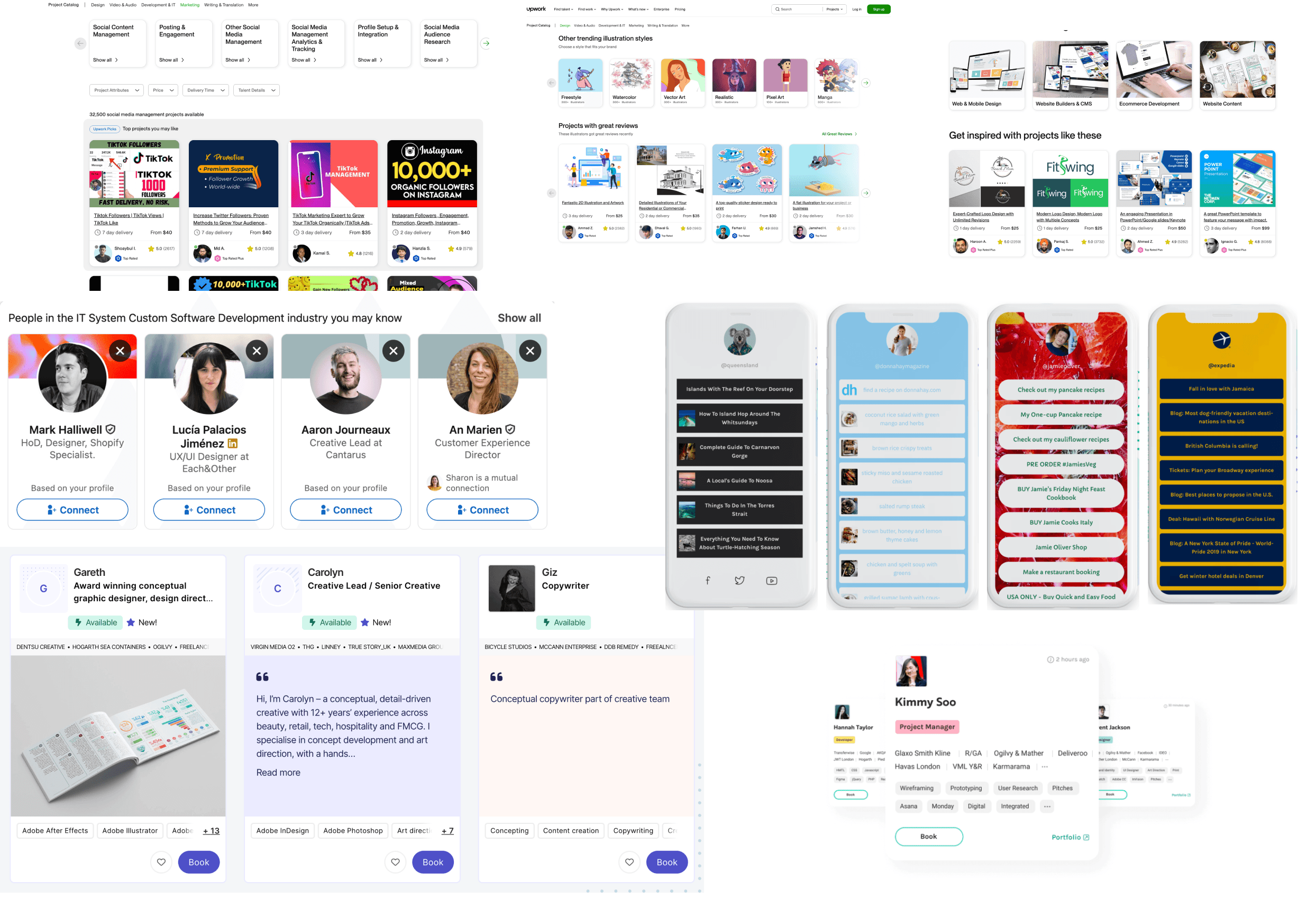
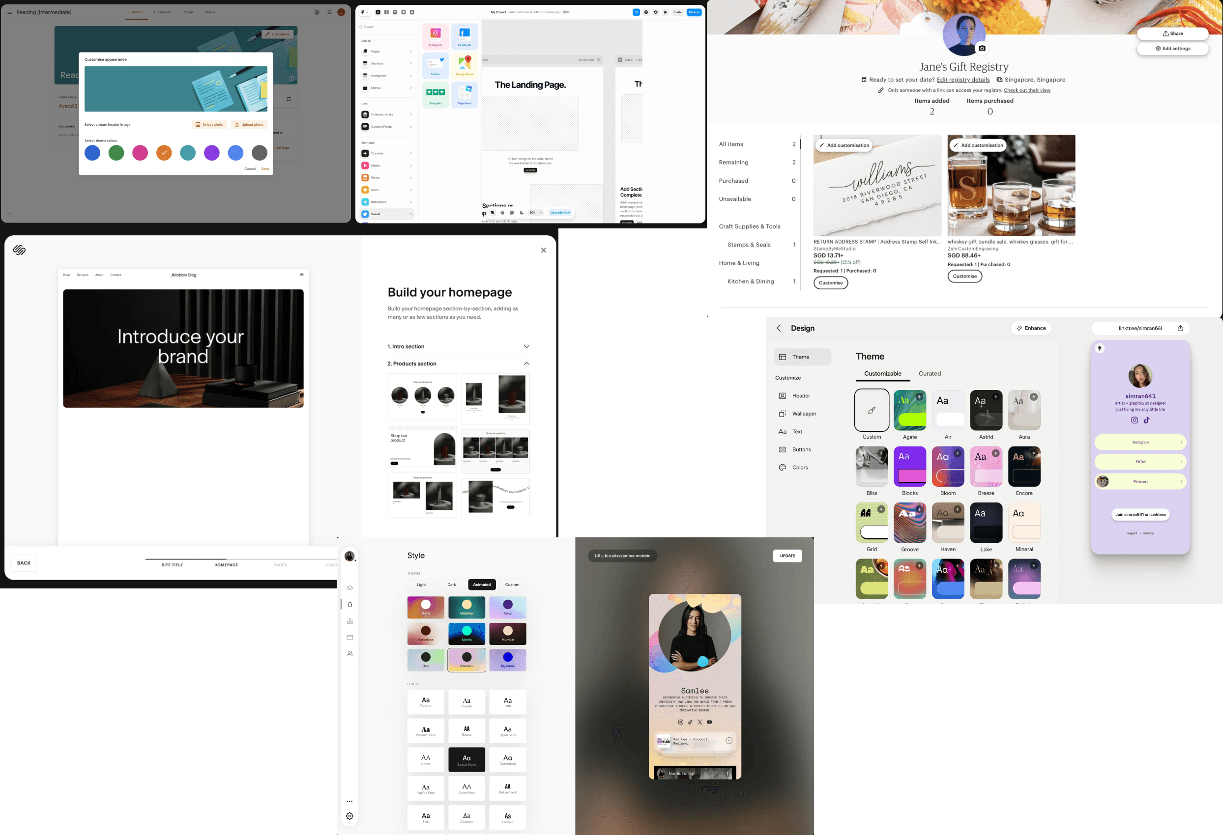
When designing the Workstreams’ Marketplace, a creative problem was finding harmony between Workstreams’ branding and the numerous other branding visuals of clerks looking to market themselves on the site.
During research, I studied sites which allowed users to personalise and market themselves; LinkedIn, UpWork, Etsy and more. These sites successfully retained their own brand voice while allowing space for its users to personalise their profiles to make themselves stand out. Features like customisable banners, profile pictures, and colours for their personal pages were popular across these websites.
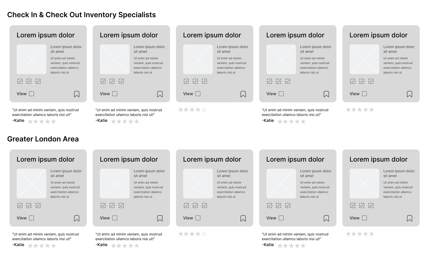
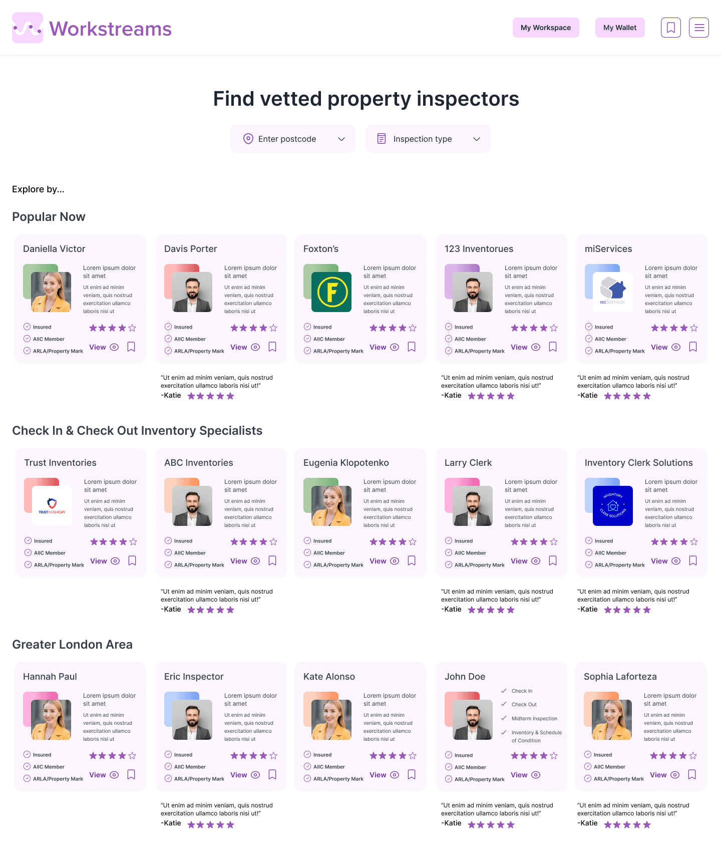
Wireframing a “shop window” style visual for each clerk on the Marketplace; a succinct representation of their brand, qualifications and abilities.
The Workstreams’ Marketplace had to be scrollable and easily scannable for all the clerks property managers could work with. This meant that allowing each clerk’s “shop window” design to have unique branding would make the site look too busy, overwhelming and harder for its users to process the clerk information.
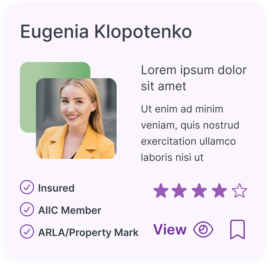
As a solution, I designed a branding slab component; a square slab in which users could freely choose a unique colour or gradient pattern to differentiate and brand their business. This slab framed their profile picture in a dynamic, drop shadow like layout, allowing for their personal brand colour to stand out in a design that was unique to Workstreams Marketplace.
Brand aligned, and creatively free
Marketplace wireframe
Branding slab
Full Marketplace Profile
Live Marketplace Profile
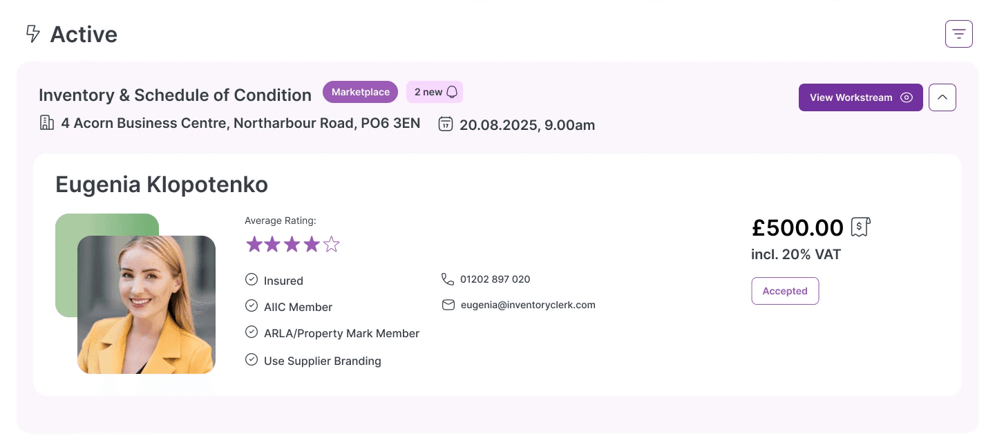
Branding slab
Branding slab on active workstream tab
Branding slab on shop window card
Marketplace Profile Editor
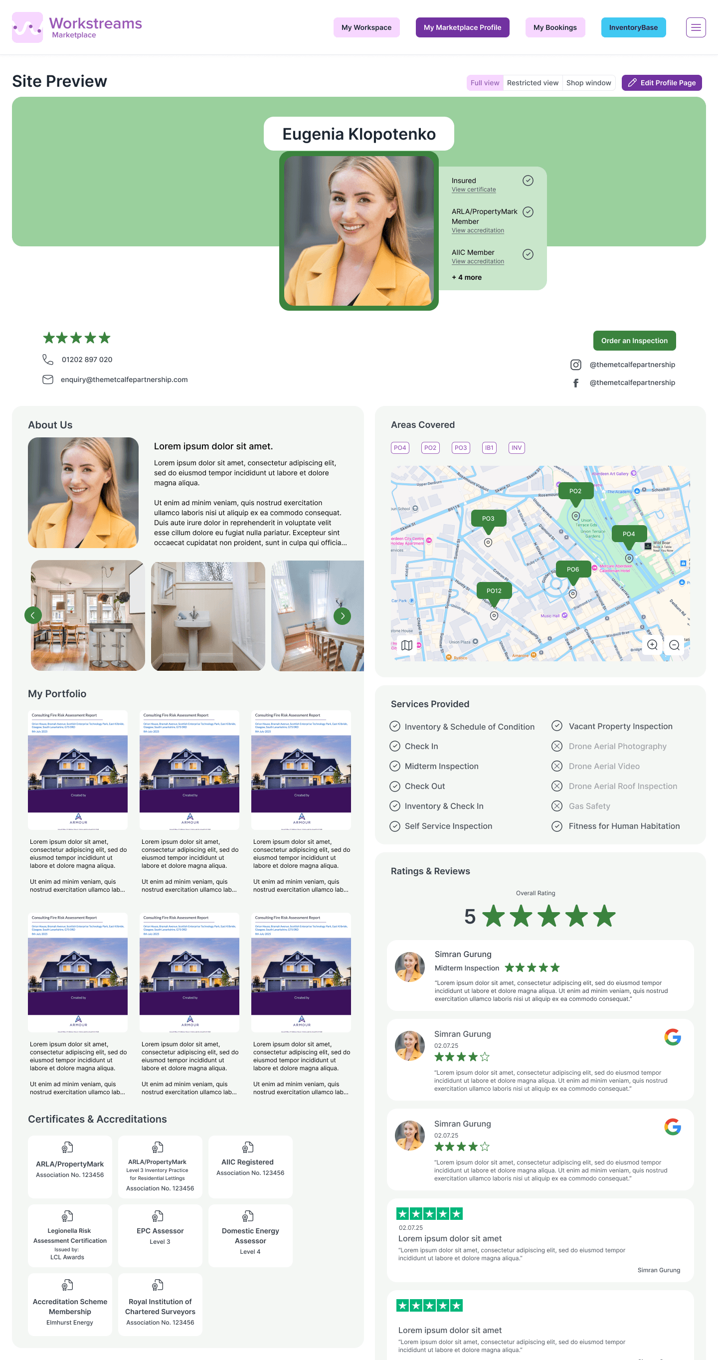
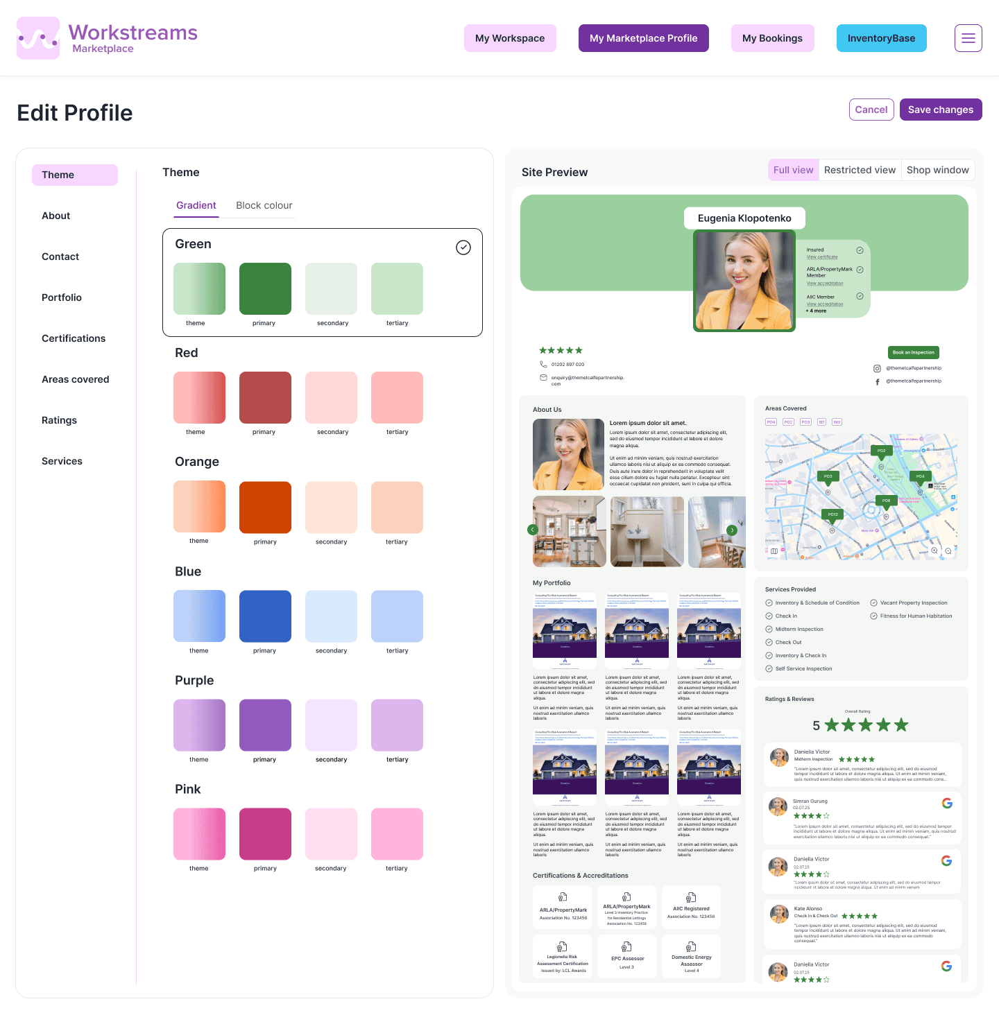

For the full view of a clerk’s Marketplace profile, the branding slab colour/gradient pattern translated into a horizontal banner which clerks could personalise by editing their profile. Each theme came with a ready-made, complementary set of colours for the whole page (compliant with at least WCAG 2.1 Level AA) to give their profiles a stronger brand and identity.
This set of branding options and controlling of personalisation through consistent design components, Workstreams achieved a visually-pleasing balance between the primary Workstreams branding alongside unique clerk pages.
PRODUCT DESIGN
The Problem:
Our value proposition was right on the nose; users of Workstreams found the service to be a helpful way of tackling their increased workloads and working with external suppliers, all within Inventory Base as the parent software. However, it was not widely used. Due to Workstreams living underneath a small tab on Inventory Base, our initial research phase revealed customers were not aware of Workstreams, or even understood what it was when clicking into it. The Workstreams page looked underwhelming, provided little context, and appeared very similar to a standard page in Inventory Base.
Workstreams lacked a strong brand identity and purposeful presence as a SaaS product, thus failed to engage our users.
The Approach:
Collaborating with the Product Manager, Lead Developer, and CEO, we honed in on Workstreams’ unique selling point - it’s ability to outsource jobs to any external suppliers. We noticed it followed a similar model to popular Marketplace services like AirBnB, UpWork, and even Uber.
Property managers were essentially looking for qualified, available clerks to complete their jobs and build professional connections. A Marketplace model where clerks could promote themselves to acquire these jobs, and managers could easily search for clerks to outsource work to, made perfect sense.
This enabled Workstreams to have a stronger, appealing brand presence, and widened its reach by establishing itself as a standalone B2B marketplace site, as well as a built-in service for clerks with Inventory Base.
Designing a new Workstreams
Reaching the solution
How could “Workstreams” could be portrayed in a clever and immediately recognisable way?
Drawing squiggly line graphics to symbolise an actual stream I experimented by placing this against the brand’s purple and a “W” graphic.
Using the abstracted “W” in a squiggly line graphic added slight playfulness
and verve to the logo. Placing it against the lighter brand purple background,
I added dots along the line to symbolise a work stream.
The three dots were also meaningful to Workstreams’ brand identity as
it correlated well with Workstreams’ three workspace pillars:
Marketplace, Contracts and Suppliers.
This logo was clear and efficient in telling the story of Workstreams, establishing a unique identity by alluding to a “W”, while being a cleverly memorable yet professional symbol of the brand.
Looking at the current icon that portrayed Workstreams and conducting visual research around the term “work stream”, I discovered graphics of lines connecting a series of dots or icons.
This visual conveyed a workflow being distributed across a network, thus symbolised the purpose and functionality of Workstreams.


Final logo
Pillar logo variations
LOGO DESIGN
As a B2B product built around a traditionally D2C Marketplace model, we wanted Workstreams to have a cooler feel to its logo and brand identity, while still remaining professional and clear in its positioning as a SaaS product.
Research into other successful B2B and consumer-facing SaaS logos to perform competitive benchmarking:
Crafting a unique brand identity
BRANDING