


A pleasing, scannable palette
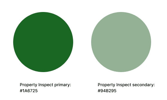
The colour palette played an important role in the designs; the colours used had to be eye-catching to draw attention to key informations, while not overwhelming the eye and brain with too many colour signals, or clashing with Property Inspect’s signature green branding.
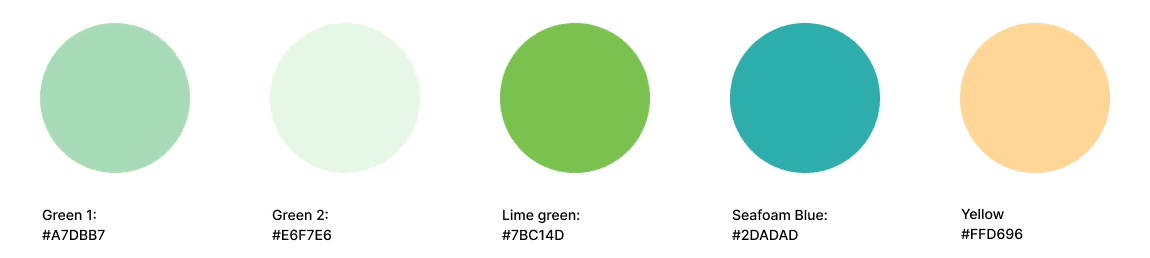
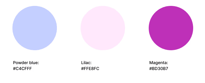
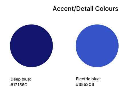
To achieve this, I experimented with bright pastel palettes to curate a few key colours which could represent different data graphics, along with neutral greys and whites to balance them out. This allowed the infographics to be visually clear and easily scanned for the correct information, while working harmoniously with the software’s green branding.
VISUAL IDENTITY
Making data friendly
The Analytics dashboard had to be simple to read, and not burdening to the user with multiple complex statistics and big numbers.
Competitive benchmarking was carried out to understand and improve upon the data solutions users were presented with in similar SaaS enterprise products.
CRAFTING DATA VISUALISATION
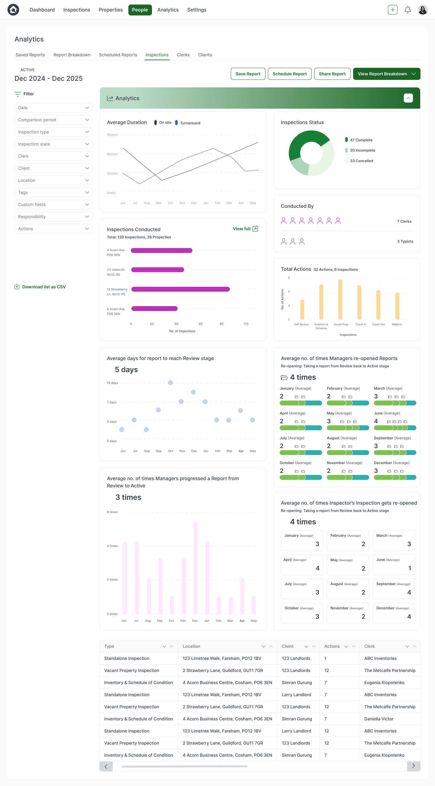

Average duration of turnaround, average number of actions across Inspection jobs
Number of Inspection jobs in “complete”, “incomplete” and “cancelled” statuses
Defining the product solution
With our research, we defined the main pain points as being “unable to track status of all Inspection jobs”, “unclear productivity reports” and
“unclear tracking of operations efficiency”.
We included the specific analytics titles users requested, as well as devising further supplementary Analytics to test on users.
For example, number of inspections completed to date to provide further relief to not being able to track statuses of all Inspection jobs, and number of times a Manager versus an Inspector sent a report back to Active stage from Review, in order to portray delays/iterations in the process from different roles.
These Analytics accurately and usefully represented the needs of users:
Average number of personnel assigned to an Inspection job
Average number of inspections conducted
Average number of days an Inspection took to reach Review stage
Average number of times managers sent an Inspection back from Review stage to Active stage
Average number of times an Inspector sent an Inspection back from Review to Active stage
Average number of time Mangers progressed an Inspection from Review to Active stage
USER RESEARCH
The results
73%
user retention rate on the Analytics page
Resolution of large user pain points around insufficient analytics reports through a simple, salient, and engaging dashboard.

Full year's analytics
Minimal filtered analytics
Final Designs
Minimal, filtered Analytics
Full year's Analytics
I created rounded graphics and icons with minimal harsh strokes to inject a sophisticated playfulness and visually-pleasing quality.
Including different infographic formats helped accomplish visual interest.
To act upon user testing data which revealed difficulty in easily comprehending the bubble chart and ring chart data, I replaced these with another bar chart and a simpler scatter graph. Having a repeated pattern of bar charts and a more uniform scatter graph was successful in providing predictability and comfort in the user experience design, with a 65% decrease in time users spent deciphering the chart.
This helped users in processing the data easily by using laws of familiarity.
ITERATING DESIGNS
Shaping designs with data

"View full" buttons were added to each Analytics widget to allow users to view the data in expanded detail.
A "Back to Report" button at the top left-hand side ensured users had a readily accessible pathway back to their Analytics dashboard.


Prototype two
Prototype three
Prototype one
In this prototype, users found the data visualisation clear and simple to understand.
However, 80% reported the ring graph to be harder to decipher.
Users also expressed desire to view each Analytic widget in an expanded view for further detail.
When testing out prototype variations on users, the designs gathered positive feedback on the mostly clear, user-friendly graphics, and the fixed filter panel to easily control the parameters of data shown.
Problem areas included not being able to locate the inspections information table underneath the graphs as easily, not all of the infographics being as simple to understand or read, and not being able to view all of the Analytics widgets in expanded detail.
Prototype two saw users responding more positively to the simplified infographics, but demonstrated confusion and longer periods of time to locate the full Inspections information table below the Analytics graphs.
USER TESTING
Prototyping for feedback


What did users want to see?
Reviewing user feedback, the most popular statistical requirements that emerged were:
How many Inspection jobs were complete and incomplete?
How many Inspection jobs had been completed to date?
How many staff it took to complete
a single inspection?
Average turnaround of jobs?
How many times an Inspection got sent back to Active stage, after its Review stage?
USER RESEARCH
Ensuring usable interfaces
In order to keep the Analytics page familiar to users, we chose to keep the table of all Inspection jobs completed underneath the Analytics widgets section.
To make getting to this table of Inspection jobs easier when users do not want to go through all the Analytics, the Analytics widgets was turned into a collapsable section. This way, people could easily control how much they see on their screen at once, and how fast they can retrieve specific information from the table.
Additionally, "Jump To" button was added to allow users to quickly and effortlessly navigate to the Inspections table.

ITERATING DESIGNS
Iterating for device responsiveness
When collaborating with developers to understand technical feasibility, it became clear that the widgets needed to followa uniform, standardised sizing rule.
Widgets which were thinner or taller than others responded poorly across various screen sizes, resulting in some widgets being too small or thin to be accurately read.
Therefore, I altered all the widgets to be even sizes in width and height to ensure each would retain clear, readable dimensions across varying devices.
For mobile screens, I placed all widgets vertically on top of each other to give full focus to each analytic on the smaller, restrained mobile screen.
The side filter panel also sat as a collapsable horizontal panel, to avoid eating up precious space on smaller mobile and tablet devices.


MOBILE RESPONSIVENESS
Mobile filter panel