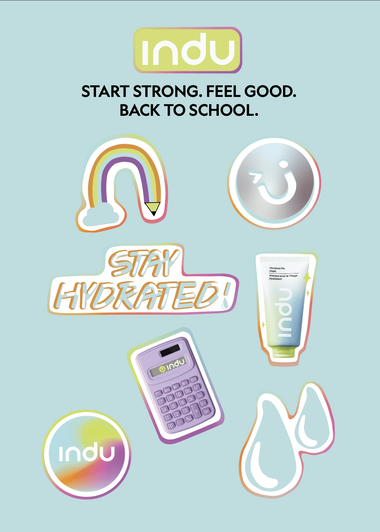
Everyone loves free stickers
PRINTED STICKER SHEET
As part of the Back to School limited edition sets and PR packages, indu also handed out free stickers for teens to stick on their exercise books, school folders, or water bottles.
Considering Gen Z’s affinity with bold, colourful and expressive artworks, I devised this set of stickers to give school season a positive boost from indu.


The Brief:
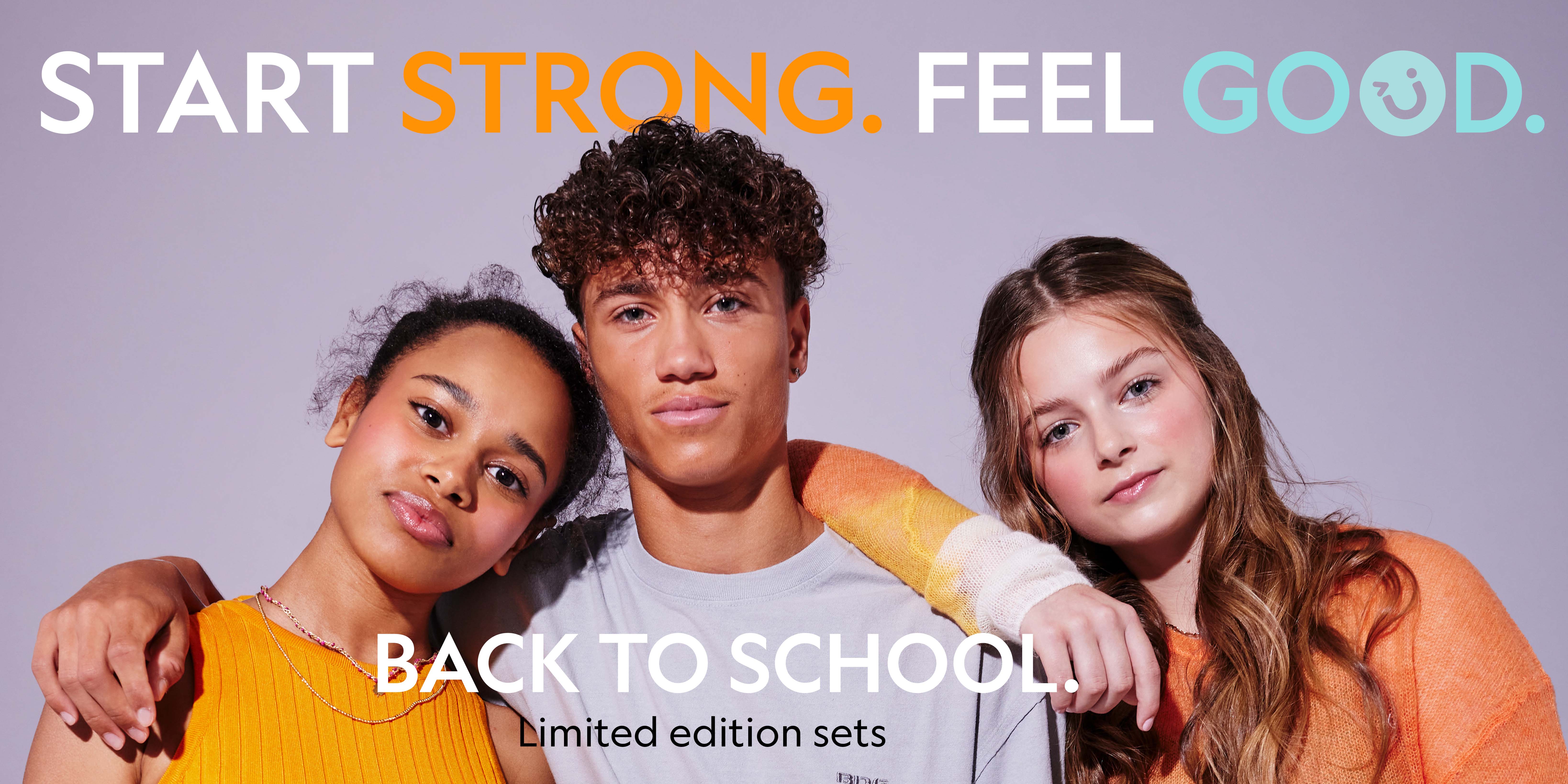
Back to school is a big event for teens everywhere; a new start for their next chapter of learning, friendships and growth. So indu wanted to put them on the right track by helping them “Start strong, feel good”.
The Deliverables:
Responsive eCommerce homepage banners.
A printed sticker sheet free with limited edition bundles, and included in PR packages sent to select influencers.

Back To School Campaign
About the Brand: indu is a skincare and cosmetics brand on a mission to help teens and young people navigate beauty culture in a healthy way.
Created by the founders of Feel Unique, indu trades via eCommerce and retail Sephora stores across the UK.
Graphic Design


Role: Graphic Design, Digital and Print
Tools: Adobe Illustrator, Adobe Photoshop
Industry: Beauty, eCommerce, D2C
Aligning with campaign strategy
VISUAL DIRECTION & DESIGN
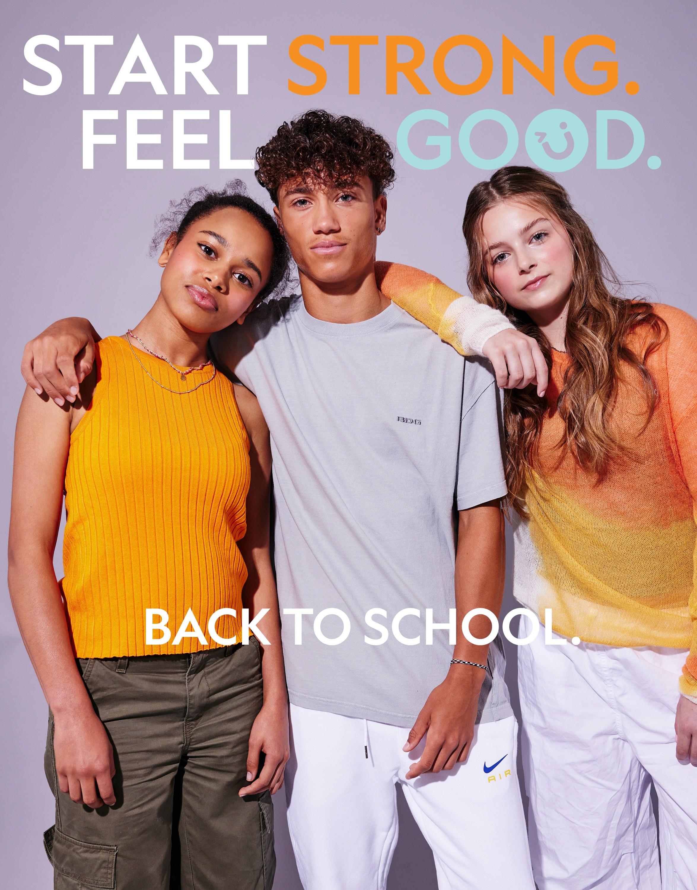
16x9 banner
4x5 banner
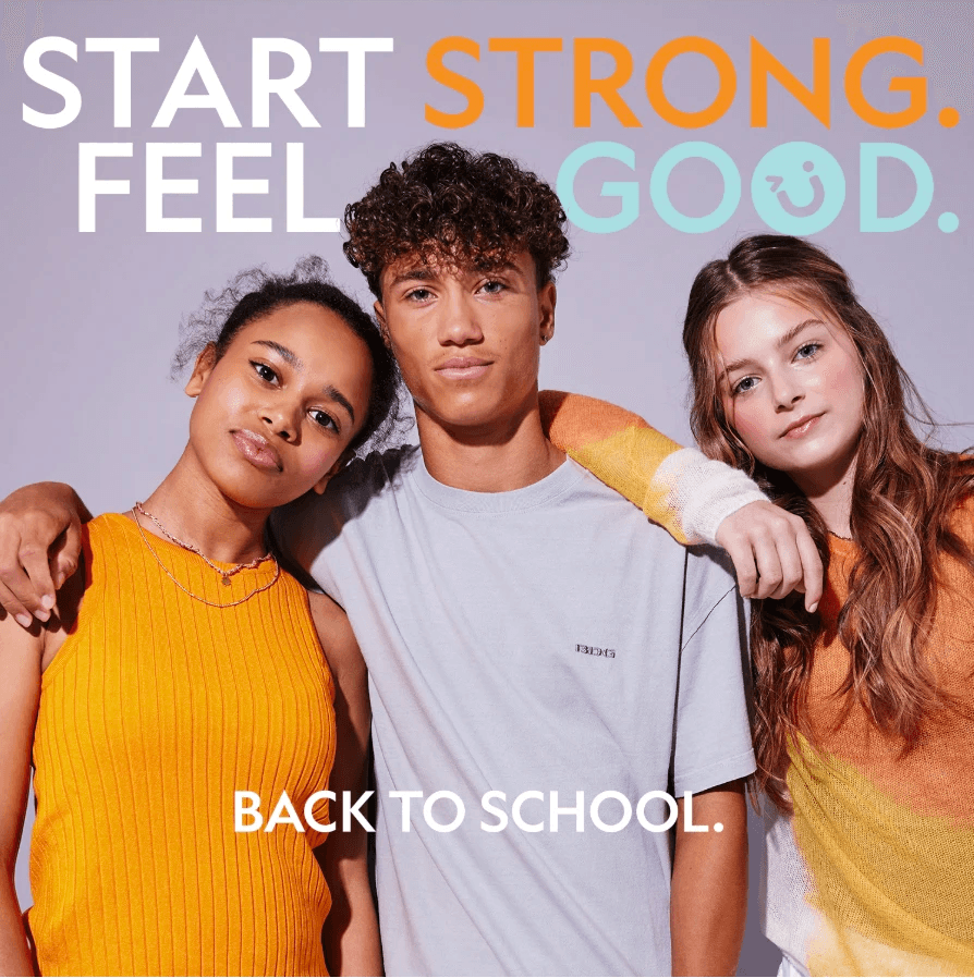
1x1 blog cover & social post
The campaign’s strapline “Start strong. Feel good.” was impactful and delivered indu’s message perfectly.
indu’s strategy for this campaign was to encourage Gen Z teens to embrace skincare and natural, light make-up for their school days. The brand wanted teens to feel empowered at school, not bogged down by their cosmetics routines.
To reflect this in the artwork, I selected images from our Colourless Collection shoot; the models were wearing our clear makeup range, accompanied with clean, healthy skin.
All caps, bold Geograph font with intentional placement of indu’s brand turquoise and orange effectively delivered the campaign messaging in a cool and punchy manner. In order to add a playful verve and further alignment with indu’s branding, the final “O” in “good” was replaced with indu’s signature smiley icon. Bringing the image of the models slightly forward by pushing the typography slightly behind their heads, gave more visual interest and a detailed dynamic quality to the artwork. .